
Preview & styling
Every campaign editor includes a live preview on the right (or full-screen via the preview controls in the header). Adjust layout and branding before you publish.
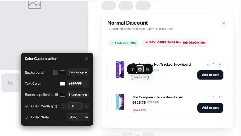
Preview panel
- Page tabs, only tabs enabled in Pages & Display for that campaign (Product, Cart, Shop, Entire site, Email, etc.).
- Desktop / Mobile, switch viewport width.
- Preview button, open a larger preview when available.
Countdown Timer and Next Order Coupon previews focus on the pages those types support (for example Shop or Email).
Style controls
Customize elements such as:
- Container, padding, background, border, radius
- Title & subtitle, size, weight, color
- Buttons, background, label, border
- Badges & countdown, colors and typography
- Product cards, images, prices, discount badges
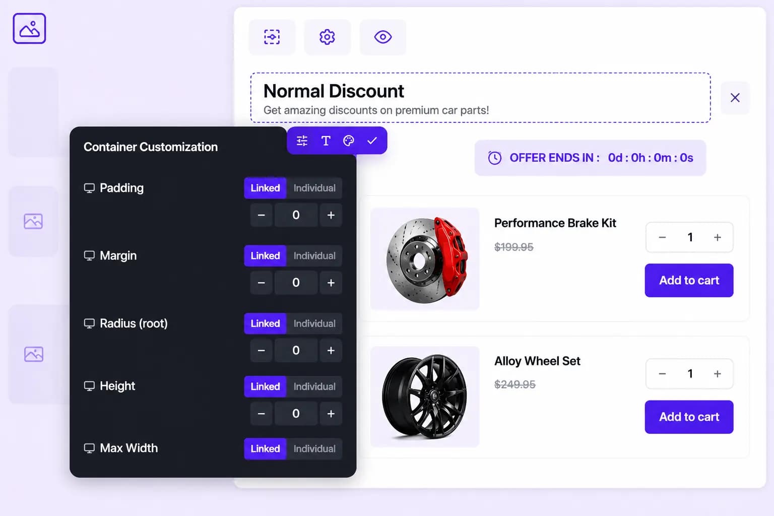
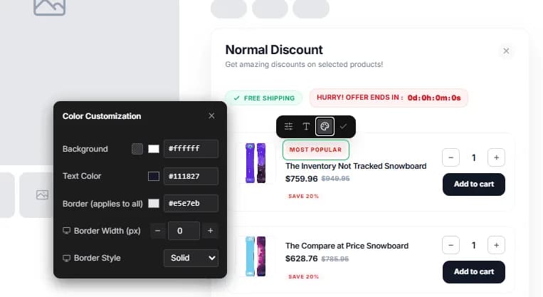
Changes in the preview panel match what the storefront script applies to published widgets.
Theme fonts
On the live store, BundleWise tries to use your theme’s body font when you have not set a custom font on the container.
Tips
- Match button colors to your theme for a native look.
- Keep titles short, two lines max on mobile.
- Check contrast on bar backgrounds (especially Entire site campaigns).
- Preview every enabled page tab, not just the product page.